Logo Guidelines & Downloads
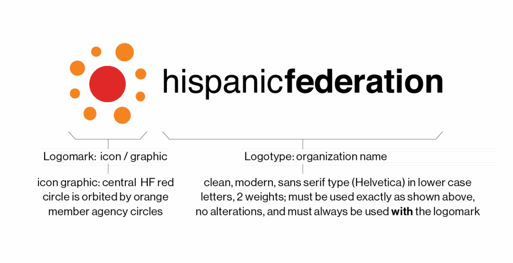
Hispanic Federation’s logo is the most recognizable element of Hispanic Federation (HF)’s visual identity.

The HF logo is the combination of the Logomark (icon / graphic) and the Logotype (“hispanic federation”) which were carefully designed to appear in specific relationship to each other, and cannot be separated. The HF logo must always be used in approved formats and configurations.
The horizontal logo (shown here) is HF’s primary logo. A secondary, “triangle” variation is recommended for applications with a vertical orientation.
Logo Downloads
HF logo artwork files are available in different formats for different production processes. Use file format that is appropriate:

Primary Logo Horizontal
Zipped folder with primary (horizontal) Logo files available for print and digital use.

Secondary Logo Triangle
Zipped folder with secondary (triangle) Logo files available for print and digital use.
Logo with Tagline (internal use only)
For HF internal use only: Logo with tagline files available to HF, print and digital formats.
Logo Usage
To ensure visibility and integrity, the HF logo should always be displayed in a clear and consistent manner on all materials.
Logo spacing and clearance
The HF logo should be given space for prominence and clarity. A minimum area of padding space (“safety area”, equivalent to the “n” in the HF logotype) should be maintained around the HF logo at all times. The safety area is for minimum space only.

Size
Large sizes: When using the logo larger than 6 inches wide, use vector outline (.eps or .ai) versions of logo, which can be scaled to any size. *Do not use jpegs (.jpg) or .png files for large print jobs.*
Small sizes: To ensure legibility, the HF logo must not appear smaller than 1.5″ wide in print or 108 pixels wide digitally (shown here).

Logo Misuses
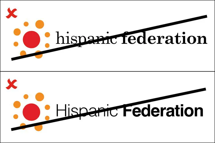
DO NOT change or recreate logotype: do not typeset Federation name; do not stack type.
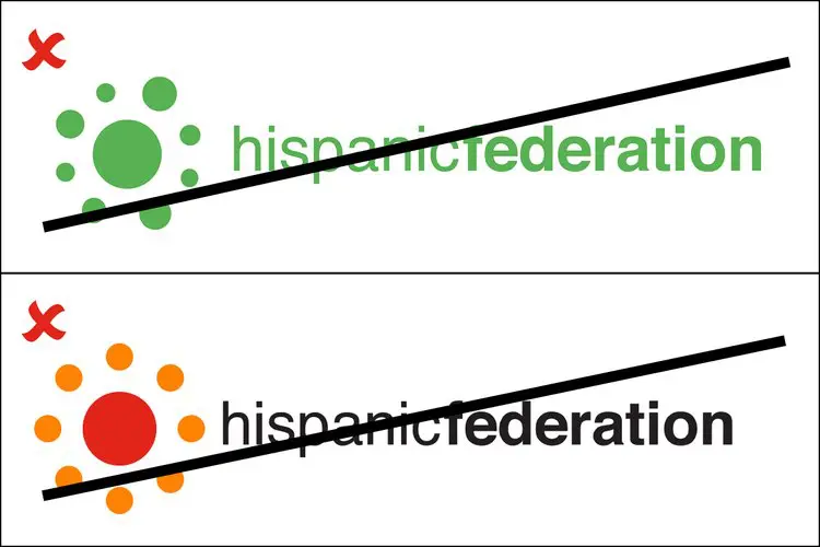
DO NOT change colors or redraw icon / graphic.
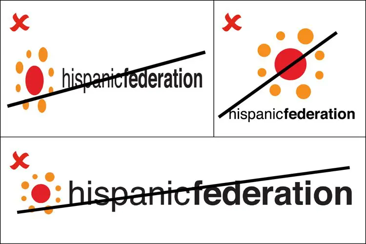
DO NOT change scale or re-size any element of logo; the scale of the logo must only be changed uniformly.
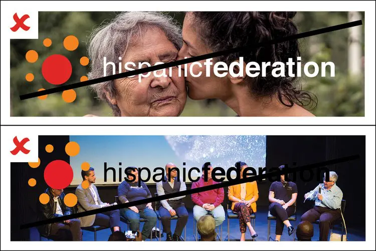
DO NOT place logo on faces; DO NOT place logo on busy images that do not allow for proper contrast and ease of readability of the HF logo and HF colors.
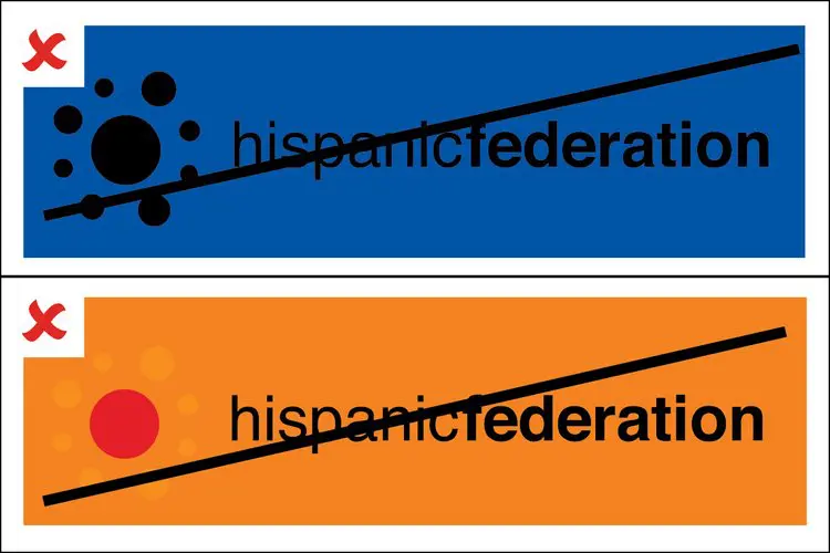
DO NOT place logo on color backgrounds that do not allow for proper contrast and ease of readability of the HF logo and HF colors.
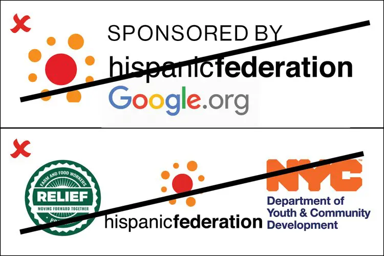
DO NOT place text or graphic elements too close to the HF logo.